


Supported by tech geniuses and influencers like Elon Musk, Edward Snowden, and Jack Dorsey, Signal Messenger is the latest excitement.
Examples of product design that fail on the ethics front are all too easy to find—like news feeds promoting fake news, ride-hailing companies psychologically exploiting workers, and virtual home assistants perpetuating negative gender stereotypes. It’s not that product designers don’t care about the ethical ramifications of their work—far from it. It’s that, too often, they assume that such considerations fall outside of their job description.
With the shift in the latest news about Design and Ethics to cooperate with it, many brands have failed to make the users rely on their product/service. Users now look for an ethical designed application that doesn't exploit their trust and transparency. While many messenger applications were breaking the conduct of ethics, Signal was launched with ethics in designs and development as per our research and knowledge to substitute the brands that have lost the reliability to the users.
Design for an application plays a key role when it comes to making it a need from a choice. With time the users who tend to use the messenger services professionally and personally looked for the applications that protected their data and simultaneously gave them a good experience.
Signal app UI/UX: Review
The signal is a cross-platform centralized encrypted instant messaging service developed by the Signal Technology Foundation and Signal Messenger LLC. Users can send one-to-one and group messages, which can include files, voice notes, images, and videos. It can also be used to make one-to-one and group voice and video calls.
As much as the application offers the feature, we have an analysis study of the Signal App design and how it offers the interface and experience to its users.
Is Signal application UI/UX on the same page with security and privacy?
One of the important features of Signal that focuses on signal data privacy and security is having the PIN to unlock the application. Signal app privacy and Signal app security are the top concerns when it comes to technology, the PIN prevents other people to be able to enter and misuse the account while the user can recover their profile, settings, and contacts by logging in.
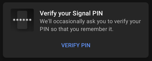
Following setting up the PIN for the opening time and verifying it, Signal delivers reminders to verify the PIN after predefined time intervals of 12 hours, 1 day, 3 days, 1 week, and 2 weeks. So, it is handy to memorize the PIN or keep it somewhere safe, also saving you from unfortunate misuse of privacy.
How is the Signal User Interface?
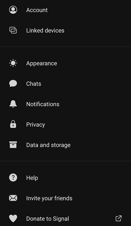
The user interface influences the user experience to an extent, moving ahead, what makes a good interface? To mention a few pointers, minimalism, clarity, typography, easy navigation, and color choice. The design of the application is fine, it is a combination of grey, black, and blue color, exhibiting the approach of reliability, trustworthiness, and positivity. Also, Signal UI/UX suggests further steps with notifications of the home page that hold all the chats. The text size and choice seem ethnic and appropriate, but the iconography is a real charm. They have used common and yet easy-to-understand icons to make the experience easy for each group. In short, the user interface for Signal Application looks clear and comfortable.

Is getting on board an advantage to good Signal app UX?
The splash screen is simple – it reminds users why they are joining Signal.
“I want more data privacy.”
Signal login is initiated to notifications and contacts so that messages can be sent to friends and notifications are turned on. While this perspective is now provided, this step happens even before a user includes basic account information such as name and number. This step seems like it can come later in the app when users submit their name and number. Why not get friendly after the basic introduction? After this Signal asks for the number and verifies it with a code sent to the mentioned number. At last, you can reveal your name to the application, and it will ask you to set a PIN for 4 digits which pretty much saves you from unnecessary chaos.
Some of the “I LIKE IT” Features of Signal app UI/UX?
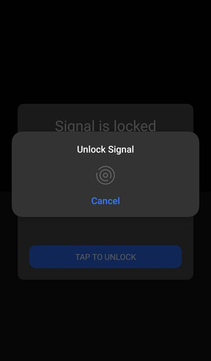
A few of the common Signal App Features are mentioned, you can set a cool profile picture, with a sassy bio, and your name! Always a choice to choose the dark or bright mode. You can have a personalized setting for notifications, but the most important is great features for security and privacy. You can choose the option to make chats disappear, set fingerprint or lock PIN, and not to miss, you can check what all devices are linked to your account. On Signal, if you’re adding members to a group, you will have to seek their consent by waiting for them to accept your invitation.
What can be improved and enhances to avoid Signal UI/UX Setbacks?
What might be lacking is more commitment with content strategy to improve context or requests and options for users during the onboarding process. While many have installed Signal, few of them have started using the app for their daily texting, and the majority are still stuck on other messenger applications. A little spotlight never hurts, ethics in design have strong support to Signal Application and this can be utilized to create the awareness of privacy and security in technology to the users.
Have you started using Signal? As much as an easy and effortless user experience is needed, how about a safe and secured one?


