


Amid digitalization, we are constantly digesting written data. From instruction on a manual to e-mail marketing, content is all around us. But we often forget the power of the written word and rarely consider the important role a designer plays in emphasizing the tone of the words and sentences.
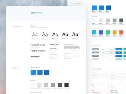
Just like strokes and paints are the art of the real world, typography is the art of the digital world. But it is so much more than simply choosing a nice font to balance a snappy text; it is the art of using typefaces to ensure the interface is unique, readable, and attractive.
Keeping the criteria of “attractive and unique” in mind, Typography is an intricate art form and an essential component of UI design. Behind the scenes, a UI designer works hard to set a balance between the style, composition, and aesthetic of the letters to prompt emotions and convey precise messages to the user. Without appropriate typography, the user experience will go for a toss.
Why is the art of Typography important?
Well-balanced typography in Digital Design will establish a strong visual hierarchy, provide a graphic balance to the website, and set the product’s overall tone. It should serve the purpose to optimize readability and accessibility and ensure an outstanding user experience.
Designers use typography to use text as the visual key to conveying a brand message. It plays a significant role in not only building brand personality and conveying messages but also grabbing audience attention and build a hierarchy. It further sets the stage for the brand to establish value and tone.
Elements under the art of Typography
Fonts and Typeface
People often confuse between ‘font’ and ‘typeface’ and use them interchangeably, but they are different things. A typeface is a collection of related fonts, on the other hand, font refers to the weights, widths, and styles that constitute a typeface. Here is an example for better understanding; Helvetica is a typeface, and Helvetica 10pt Bold is a font.
Hierarchy
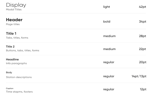
Hierarchy is the process of organizing type by using sizing, color, contrast, and alignment to establish an order of importance within the data. It further navigates the users on which text should be noticed and read first. One of the best examples to understand Hierarchy is size; different sizes and fonts of headings help to navigate the user on what to read first.
Contrast
Just like a contrast of colors emphasizes the importance of a specific color, the contrast in typography works the same way. Here, it helps to emphasize the ideas or messages that one wants to convey to the reader. A contrast can be created by playing with differing typefaces, colors, styles, and sizes to create visual impact and break the monotony of the page’s text.
Alignment
Alignment is the process of merging and creating text, graphics, and images to ensure equal space, size, and distance between each element. Lack of proper alignment can mislead and distract the reader, thus affecting the user experience on the website.
White Space
Just like in the art of photography, the empty space serves a very significant purpose of adding value to the main subject, in UI too, white space or negative space helps to establish hierarchy and keep the interface uncluttered. In typography, the blank area around text or graphics is referred to as the white space.
Rules for Typography on the screen
Now that we are familiar with the different aspects of this art in digital design, let us talk about the process of choosing the right typefaces for your website and application interface
Typography For Website
Give a personality
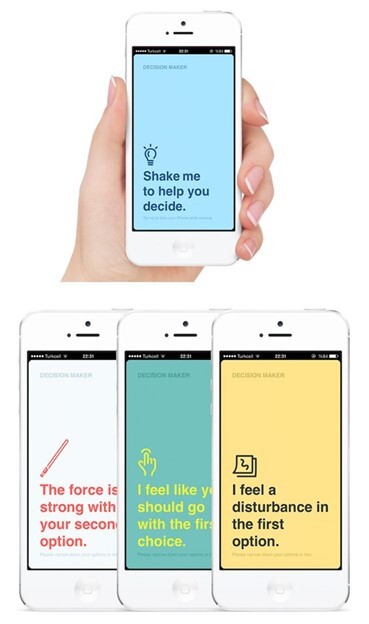
What kind of an environment do you want your user to experience when they come across your website? Do you want to vibe a friendly atmosphere or feel high-end or welcoming or playful, or serious? It is important that this art of digital design reflect the personality of the brand or product, thus leaving an impression in the mind of the viewers
Reflect on a tone
It is equally important to consider how the font sets the tone of a certain message. Therefore, while conveying a piece of serious or important information, a less decorative and styled is chosen. Setting the message clearly understandable and will limit distractions.
Perfect Functioning
If the font, typeface, alignment, and everything else is perfect and the functioning of the website is lagging, the attraction of the viewer goes for a toss. In the digital world, nothing is worse than a website that looks pretty but is entirely illegible, leading you to click the wrong button or take a wrong turn because the instructions were unclear. Therefore, it is important to set the correct style, aesthetic, and voice aside, that complements the readability and accessibility of the website.
Test! Test! Test!
Continuous testing and gathering feedback from real users is the best way to decide which font to use for your interface. This will help to get a clearer insight into what works perfectly, what needs attention and correction, and what feels clunky.
Typography for Mobile Application
Stick on one typeface
It is very tempting to use a variety of fonts and beautify the content in every possible way but using multiple typefaces on one screen would result in a cluttered interface. Whereas fonts from the same typeface work harmoniously together, sticking to one typeface will give your app screen a more organized look.
Focus on Readability
No viewer wants to end up with a headache after seeing a cluttered website and extremely fancy fonts? No matter how pretty the font is, no user should have to focus all the attention just to read one sentence., therefore, readability should be the number one priority. Some of the most readable serif fonts include Times New Roman and Georgia. Helvetica, Futura, and Arial.
Set a personality and tone
It is important to set a tone and personality for apps as well, thus establishing the kind of vibe you want to put forth to your viewer.
Conclusion
This art of digital design is often overlooked, but it plays a crucial component in the user interface. Mastering this art will help one to add expertise and perfection as a UI designer! But, if you are not sure where to start, why not head to your favorite websites and start making a note of what user interface they have gone for.


